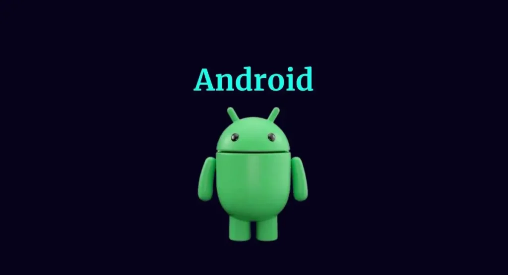
Google decided to give the Android logo a fresh look for the first time in four years. This change was a mere tweak and a complete overhaul to represent the Android community better. The update reflects Android’s open, iterative, and inclusive core values.
Google’s Official Statement on Android Logo
Google officially announced the change in the Android logo on September 5, 2023. The company decided to capitalize the “A” in “Android,” moving away from the all-lowercase style. The Bugdroid (read everything about Bugdroid) logo was also updated to a 3D avatar.
We believe our brand system and how we show up visually to the world as Android should reflect Android’s core ethos of being open, iterative, and inclusive. That’s why we’re sharing an update to our visual identity that better represents our Android community—and it’s also a lot of fun.
— Jason Fournier, the director of Android consumer brand managemenr
This year, the new 3D logo and updated branding will appear on Android devices and other platforms. Google is also hosting an event to announce the Pixel 8 series on October 4, where the new Android branding will likely appear.
What is a Logo?
A logo is a symbol of text and images identifying a business. It’s not just a mere representation; it carries the weight of a brand’s identity. A well-designed logo communicates to customers what a company does and the values it stands for.
Why Updating a Logo is Important for Any Brand
Google Debuts a New Android Logo and Adds AI to 'At a Glance' Widget#AtaGlancewidget #accessibilitytool #AI #AIupgrades #AIpoweredimagedescriptions #AndroidAuto #Androidlogo #artificialintelligence #bugdroidmascot #Design #digitizelibrarycards #Fitbihttps://t.co/fC1d48kc7F pic.twitter.com/t5NaAgq0na
— Multiplatform.AI (@MultiplatformAI) September 6, 2023
Changing a logo is not just about making it look pretty; it’s about keeping your brand fresh and relevant. So why is updating a logo so crucial? Let’s dive in.
- Shows Your Brand’s Personality: Over time, your brand might change its focus or target audience. An updated logo can better show who you are now, not who you were when you first started.
- Stays Consistent: You can design a new logo to look good everywhere, from billboards to business cards. This makes your brand look more professional.
- More Color Choices: A new logo can come in different colors, making it more flexible for different uses. This helps your logo stand out and be recognized easily.
- Ready for the Online World: These days, your logo is not just on your storefront; it’s on social media, websites, and ads. This enhances your logo’s visibility and facilitates easy recognition.
- Fresh Style: Trends change. What looked cool ten years ago might look outdated now. A fresh logo keeps your brand in step with the times.
- Gains Attention: A well-designed logo can capture people’s attention and stay easily memorable.This can give you an edge over your competitors.
Style and Design of New Android Logo
The new Android logo draws inspiration from Material design to complement the Google brand palette. It’s adaptable and dynamic, showing up where Android connects with people, communities, and cultural moments. The logo has moved away from its longstanding lowercase stylization of “android” to capitalize the “A,” adding more weight to its appearance when placed next to Google’s logo. This new stylization more closely mirrors Google’s logo and creates a balance between the two.
The Android robot, also known as the bugdroid, has also received a 3D makeover. It now appears with more dimension and character, making it a versatile and reliable companion across various platforms and contexts.
Android Logo Images over the Years
Which Android logo looks best?
— Techyvillage (@techyvillage) September 8, 2023
.
.#techyvillage #Android14 #Android13 #Android #Google#GoogleAndroid #Androidlogo #AndroidPhone pic.twitter.com/jXeFhis9fe
Explore the Content Ladder platform for more insightful articles: Content Ladder Trending News

